How I created an inclusive and consistent onboarding experience for an LGBTQIA+ mentorship platform.

The challenge
Thrive Out Loud is an LGBTQIA+ professional mentorship platform that aims to connect queer young adults with mentors in their fields who share their identities and lived experiences.
When I joined Sean’s Legacy as a lead content designer to build the MVP for Thrive Out Loud, the onboarding questions my team inherited were incomplete and inconsistent across the mentor/mentee experiences.
How do we create an onboarding experience that helps users feel safe, informed, and connected to the platform?
Duration
2 months - from ideation to user testing
Collaborators
Content design team co-lead
Apprentice content designers (2)
Apprentice product designers (2)
Lead developer
Tools
Figma
Notion
FigJam
ChatGPT
Slack
The solution
Before
I led my team in developing a comprehensive onboarding experience that addresses the key challenges we identified during our audit and research phases.
These changes resulted in positive feedback from potential mentors during user testing, affirming that Thrive Out Loud is a safe and inclusive environment for LGBTQIA+ professional mentoring.

Cluttered user interface, resulting in cognitive overload
Unclear headings & subheadings that don’t add value
Inconsistent use of terminology & voice and tone of writing
Limit of up to 3 options for identity-related questions (limited inclusivity)
After

Clear, scannable headings
Minimalistic, modern UI that appeals to target audience
Subheadings that establish trust and transparency with users
Expanded options for identity questions
Improved consistency of content guidelines
To reimagine the onboarding experience, my co-lead and I led a comprehensive Figma audit of the screens previously written and designed for both the mentor and mentee experiences.
Through this process, we discovered a number of inconsistencies in content decisions and opportunities for improvement that would guide our redesign.


Key findings and recommendations:
Craft a more cohesive matching experience across both mentor and mentee experiences.
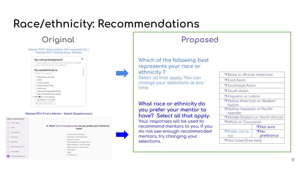
Allow for more flexibility for mentees to specify preferences for industry, focus areas, and mentor identities, eliminating the previous three-response limit.
Explain why questions on identity are being asked and how such information will be utilized in the matching process.
Establish and utilize consistent terminology (ethnic background v.s. cultural background v.s. demographics)
Incorporate UX research’s findings for the most comprehensive and inclusive identity terms to offer for the questions on gender identity, sexual orientation, and race and ethnicity.
During this audit and research phase, our team also collaborated with the Sean’s Legacy UX Research team to conduct a comparative analysis of identity labels.
I facilitated a collaboration between the content design team and UX research team on similar platforms that rely on a matching algorithm.
Content designers and UX researchers worked together to evaluate platforms like ADPList, OkCupid, and TransTech Social to determine best practices for identity label options on questions around gender identity, sexual orientation, and race and ethnicity.


Synthesized recommendations:
Allow users to select multiple options without a limit.
Include individual options for “no label,” “not sure,” and “not listed” (free text), as all of these options are fundamentally different from each other.
Reduce cognitive load by wording all three questions about identity in a parallel way.
Take advantage of the opportunity for identity questions to serve as a resource hub of information by incorporating definitions, sources, and support.
Provide more options rather than less to be inclusive of users who may otherwise be relegated to the “other” or “none” option.
Armed with our findings from our audit, I mapped out the sequence of our onboarding questions to ensure a logical and intuitive flow of questions.
In collaboration with my two apprentices, I created this simple flow chart in FigJam to determine the minimum number of required questions and the essential information necessary to create successful mentor-mentee matches:

Our logic and reasoning:
Birth date and location were presented at the very beginning to ensure that users meet the legal requirements to create an account, minimizing user disappointment down the line.
Questions on identity came next, since they are the most vulnerable for the user to answer, establishing trust and transparency as early as possible.
Questions on career and mentorship were presented at the very end to give users the opportunity to reflect on their personal goals and motivations for joining the platform as they get closer to creating their account.
Finally, it was time to put it all together! After brainstorming, writing, and editing our first shot at the copy, I created these preliminary designs to collect feedback from our team.


While the first iteration of the designs already addressed several issues with the original designs, there were still several opportunities for tightening up the copy:
Some language felt overly formal, which wasn't aligned with our voice and tone principles of being warm, informal, and inclusive.
Based on their competitive analysis of identity labels, UX research recommended turning the onboarding questions into a resource hub of information for users. Our first iteration of designs included their recommendations for identity label options, but we had yet to incorporate the resource hub.
Legal requirements for creating an account (18+, U.S. resident) needed to be communicated more clearly upfront to mitigate user disappointment.
As a platform dedicated to serving the LGBTQIA+ community, ensuring inclusivity and user safety on Thrive Out Loud was a top priority. One way we decided to solidify trust was by turning the onboarding questions into a resource hub of information.
This resource hub would exist in the form of tooltips with clear, inclusive definitions for terminology like chosen name, gender identity, sexual orientation, and race and ethnicity within the onboarding questions.
Not only would these definitions demonstrate that Thrive Out Loud is a platform that respects and understands the wide spectrum of identity, but they would also help our platform be cognizant of the wide range of familiarity users have with such terms.


The second iteration of our designs incorporated updates that made sure legal disclaimers were abundantly clear, the tooltips, and better alignment with voice and tone principles.

During user testing with prospective mentors, the UX research team found that users felt assured that Thrive Out Loud is a safe environment for professional mentoring.
These findings confirmed that we were able to establish an open, trusting relationship with users through the intentional design of our onboarding questions- a huge win for content design!

Iterate, iterate, iterate!

Moving forward, I hope to further improve upon these questions by implementing UXR’s findings and recommendations from user testing.
Notably, the team found that mentors wanted additional options for focus areas and industries, as well as an additional text field to suggest potential focus areas. These improvements will allow mentors to have more flexibility with specifying their areas of expertise and for mentees to be able to find the right mentors with the experience and interests they’re looking for!